"Bringing up a family should be an adventure, not an anxious discipline in which everybody is constantly graded for performance." - Milton R. Saperstein
In my home, a sturdy door separates the entry hall from the family room, kitchen and laundry room. Not only does this door serve a very useful purpose in keeping pets, small children and at least some kinds of noise in their proper places, but it also symbolizes an important demarcation. On the entry hall side, I do my best to maintain a tidy sense of order; because it is the first part of my home that a visitor will see, I make it a priority to keep this space neat, clean and clutter-free. First impressions really do matter.
But once I pass through that doorway and into the busy spaces on the other side, I know that all bets are off. These rooms - the family room, the kitchen and the laundry room - are not just living spaces. These are the hardest working rooms in the house. The functions of the kitchen and the laundry room are fairly obvious, and we will tour those on another day. But this time, I will show you around our all-purpose factory space, also known as the family room.
This is the view in from the front entry hall - you can tour that space here.
Before you step in, I just need to warn you. My family room is a place where we all gather to hang out, watch TV and play video games. Besides the six of us and our four pets, there is an ongoing parade of guests who spend time in here, including babies, grandmas, hungry teenagers and men with beer. We play chess, sew, paint our nails, do calculus homework, reorganize photo albums, watercolor, fold laundry, make collages, write letters, sculpt with clay, you name it. We talk in here. And we eat in here. It's an intense, crazy, messy place sometimes. I'm glad of that.
It's important to me that this room be comfortable and adaptable to its many different purposes.
But it's such a wonky little room. It's got several quirky features that present interesting design challenges: a massive brick fireplace, faux wood support beams, an angled wall, two entry/exit points that both require a step up/down, and a railing room divider. As we walk through the room, I'll walk you through my strategies for making them suit our purposes in this busy space.
Design challenge: The massive brick fireplace. I love the big brick fireplace and the mantel shelf, even if it does overwhelm the room a bit. Okay, a LOT. But I've wrestled it into submission by balancing its bulk with two other large pieces in the room - a white bookcase and a natural pine cupboard that hides the TV. They form a tall triangle in the room that brings each into harmony with the others, but the mantel gets top billing as the focal point.
 |
Over the years, I've tried many different arrangements on the mantel. It's tricky to find accessories that make an impact against all that bricky red but this current layout is really working for me. The old oak-framed mirror has been mine since childhood; my mother bought it for me to place on the oak dresser that now lives in my entry, as I showed you here. The four paintings in front of the mirror were done by my second oldest as part of a show she exhibited last summer. On the left is an assortment of pewter and silver candlesticks and mercury candleholders; on the right is a new turquoise lamp from Target.
The story of how these objects made their way to live together on my mantel is a serendipitous one that deserves a telling on a separate post, so I promise to tell you about that another day.
{The worn spots on the mirror are an important part of that story; take note of them for future reference.}
|
Design Challenge: The faux wooden beams. As for those fake beams, well, I've decided to embrace their 80s chic and leave them be. I've entertained thoughts of painting them to match the ceiling or ripping them out, but in the end, I kinda like them. They enhance the cave-like vibe of the room and even if they are not real beams, they are real wood from real trees. I choose to bless their authenticity and value them as the really top-notch garland supporters that they have proven themselves to be.
Design Challenge: The angled wall and the steps up/down. Step down from the hardwood hallway to the carpeted family room, and stop in front of the pine cupboard on your right. Notice that it is placed against an angled wall. Notice that on the other side of the cupboard is another step up to the hardwoods. Hmm, that wall has been such a nuisance, chopping up the whole corner of the room that is already broken up by the steps up and down.
Updated with a fresh coat of paint this summer, the bookcase provides not only a ton of storage but a huge punch of light and visual interest in a dark corner of the room.
Because this room is first and foremost a place where things happen, my decor is required to yield in two important ways:
1. No pillows or throws allowed on the big couch.
2. No cutesy styling of the coffee table.
I'll fully admit that I have broken my own two rules countless times over the years, and I always regret it. Blankets end up in a heap, the dog kicks the pillows on the floor - it's just a mess. So I embrace this fact: a busy couch is for PEOPLE (and pets who think they are people) but not decorative objects.
Ditto on the coffee table. At a moment's notice, someone may come in here wanting to set up an iron, give themselves a pedicure or eat a banana split. They do not want to disassemble my visual display, and I do not want them to knock it to the floor OR perform their task over the top of it. So. This arrangement is our compromise. One quick move puts the tray on the floor and that solves most of the problem.
 |
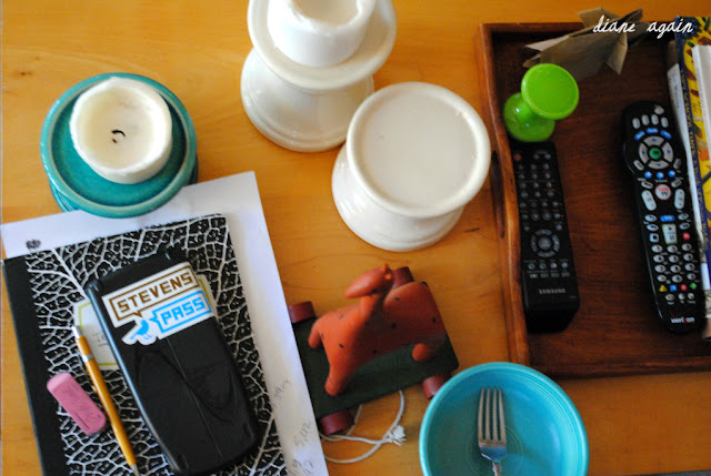
{In fact, here is how the table looked, from the other side, just a few moments after I finished this photo shoot. Homework, extra candleholders, ice cream bowl and a bright green kitty toy quickly added themselves to the table top. Hey people, entropy happens. }
|
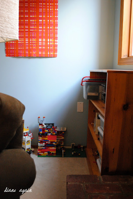
My fourth daughter is a LEGO maniac. Despite the fact that she is a lot older than ten, she has no desire to stop building fantastic LEGO universes and I have no desire to discourage her. So the turf behind the couch is her private world, and don't look now but I think that crazy angled wall and my torqued furniture arrangement creates a perfect space for her.
Which brings us back around to the big bad brick fireplace; you'll notice symmetrical windows and bookcases flank the beast and help blend it into the room. Since we got our cats last winter, I've tried to keep the tops of these bookcases clear - they are used regularly as a kitten highway - but today I did an impromptu arrangement with some printable art that I obsessed about here, paired with some jars full of scientific specimens.
Yes, I am one of those people who saves rocks.
I love them.
I have jars of sand and shells and beach glass.
I have a honey comb and two halves of a robin's egg.
I have rocks from Rome and pumice from Pompeii.
I also have a pretty solid collection of sticks.
I keep them in a set of repurposed pickle jars and we all live happily together.
I hope you can be okay with that.
Let's turn around now and get a glimpse of this little back corner. Designed to be a second dining area, we've always treated this space as an extension of the family room. But do you see what I see? There it is; our final design challenge!
Design Challenge: The railing room divider. I really dislike this spindly device. I fantasize about taking a power saw and just exorcising it from the room like the demon that it is. But until I can pay someone to come and do that properly, I live with it. Sigh.
The table and chairs are IKEA and serve us well for puzzles, big messy projects, photo shoots, and stacks of stuff that need to be put away. We use it to serve meals to huge groups (the table has leaves and seats ten or so) and sweet messy children who deserve the grace and mercy of non-carpeted floors while eating.
Years ago, my husband and his father built the cupboard that is now red. While he was in grad school, the bottom half served as his desk and the top was his bookcase. In more recent times, these pieces have done duty all over this house, including a stint out in the garage as a tool bench. Last summer I painted the set red and upgraded them to china cupboard, with this collection of thrifted white goodness. And the giant turquoise vase. Which I love.
The art is mine. The big flower has hung there for a few years; the two-part leaf set was originally up on the mantel but one day, I set them down there on the floor under the flower while I was cleaning and decided that was a better home for them.
Just to be honest, this table is almost never bare. Right now, it's sporting a set of mini-hardcover classic books that my daughter dug out of an upstairs bookcase, and a pile of Dr. Seuss books that I picked up from the library yesterday. Once again, this factory is rumbling into action.
* * * * *
Want to see the rest of my house? Check these out:
Home Tour: Old Dogs, New Tricks
Home Tour: She Will Move Mountains
Home Tour: Something Old, Something New
Home Tour: Old Dogs, New Tricks
Home Tour: She Will Move Mountains
Home Tour: Something Old, Something New


I wish I can have a home like yours..
ReplyDeleteThank you, Lokhman. What you wish can come true!
ReplyDeleteDiane, where did you get the pewter & silver candle holders on your mantle? I would love them for my mantle!!
ReplyDelete